Edit by Device
In most cases, edits made to one device appear on all devices. For example, when a row is deleted on the tablet view of your site, the row will also be missing on the desktop and mobile views of your site. This is because your site is responsive, thus sharing content across all devices. However, you may want to differentiate which content appears on which devices. You can use our edit by device features to accomplish this, and serve your visitors content that is appropriate for the device they are accessing your site from.

When making edits to a specific device, it is often necessary to switch views. For more information, see Switch Views.
View Information Bars
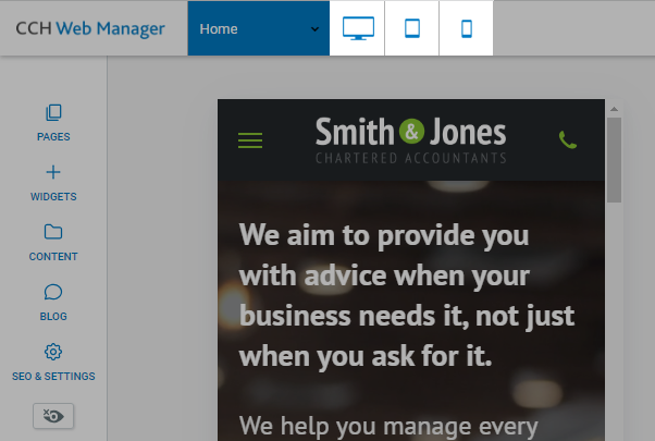
Some widgets and features may only appear on certain devices. To change the style of a widget on a certain device, click the device view on the top navigation bar to switch to that device view, and then make your change.

Hide-on-Device
Almost everything in the editor, with the exception of the header and footer, can be edited on a per-device basis by making the content specific to that device.
To edit content per-device:
- Copy the content that you would like to be device-specific. Right-click the widget, click copy, then click paste.
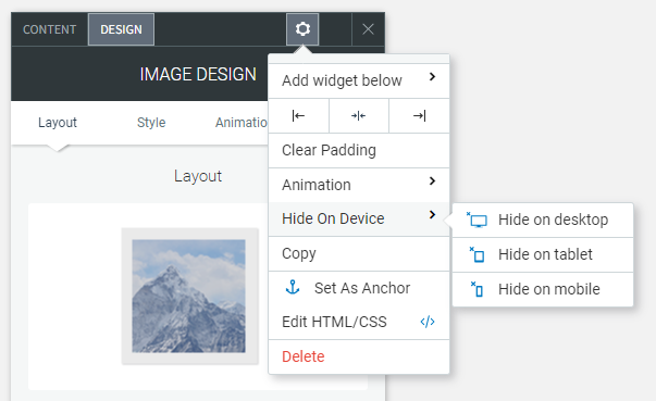
- Right-click on one of the widgets, select Hide on device, then select the device where you want the widget to be hidden. For example, setting a button to Hide on Desktop removes the button from the desktop, but displays the button in the tablet and mobile sites.
- Click on the original content and select Hide on device, then hide the content on the device(s) on which you do not want to change this content. For example, if you set your copy button to Hide on Desktop, you would set the original button to Hide on Tablet and Hide on Mobile. This way, you will have two different buttons; one showing on your desktop and a different one showing on your tablet and mobile.
- If you want the content to be different on all three devices, you can copy it again (so you have a total of three copies of the same content) and have a different button displayed on each device.
- You now have two (or three) identical, but different pieces of content, each displayed on a different device. Any further changes made to this content will only affect the device on which it is set to show.

Edits That Do Not Affect Other Devices
There are several edits in the editor that can be changed without affecting mobile. These are:
- Spacing (Margins and padding)
- Positioning
- Width
- Height
- Site/Page background
- Font size (it will not affect text that has been edited in mobile before)
- Changes to the header and footer on tablet view do not affect the desktop and mobile view
Note: Every other edit you make in the each device view will affect other devices.
Besides the list above, there are other edits that you can make to settings without affecting other devices too. These display with an Edits only affect this device icon in the editor.
Widget-Specific Changes
While some widgets work fine across all devices, there are some drastic differences between devices which creates a need for a different set of features or design preferences per device.
Below is a list of widgets with design suggestions and notes for tailoring certain widgets on certain devices.
Background Images
Due to drastic differences in aspect ratios between devices, it's important to take special care with how you design images in your website.
For example, a full page background on a row might look great on a desktop device, but horrible on a mobile device. This might be because desktop devices are more suited to larger width images, while mobile is the exact opposite.
You can set a different Page background per device in the global design settings. It's recommended to use a wide background image for desktop, and a narrow one for mobile or tablet.
Slider Widget
As with the background image, the images you selected for the desktop version of the slider widget may not look as great for tablet or desktop. It's recommended to either:
- Adjust the frame size for the slider to fit on mobile or
- Hide the slider on desktop, and create a version specifically for mobile instead
Images and Icons Widget
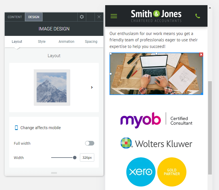
The image widget's size is not automatically adjusted in the mobile version. It's important to check your mobile devices where the image widget is used to make necessary adjustments to fit.
Hover Effects on Tablet/Mobile devices
Compared to desktop devices, tablet and mobile devices do not have a hover effect at all. Any hover layout or option is disabled on tablet/mobile devices.
Considerations
When editing device specific widgets, remember to check all views before publishing your website. Widgets can be easily misplaced when using the 'Hide on Device' option.
