
Property Listing
Content Editor
To access the content editor, right-click the widget, and click Edit Content.
To add a new item click the +Add Property option which appears under the existing items in your widget, this will then give you the pop-out panel to populate the details for this item.
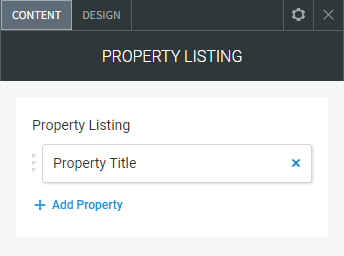
To edit the details of an existing property in your widget, click the item in the list and then use the fields in the pop-out panel to edit the item.
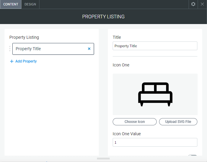
The following fields and options can be set for each individual item in your widget:
- Title. The title of the property
- Icon One. The bed icon
- Icon One Value. The number of bedrooms
- Show/Hide Icon One. Hide icon one and the value
- Icon Two. The shower/bath icon
- Icon Two Value. The number of bathrooms
- Show/Hide Icon Two. Hide icon two and the value
- Icon Three. The car icon
- Icon Three Value. The number of car spaces in the garage
- Show/Hide Icon Three. Hide icon three and the value
- Address. The address of the property
- Price Details. The price details of the property
- Details. Extra short details of the property
- Show/Hide Banner. Show or hide the banner across the image
- Banner Text. The text that displays in the banner
- Property Button Text. The text on the property button
- Property Link. The link to a page created with more info about the property
- Main Image. The first main image on the property listing
- Image (two to eight). Add up to eight more images
- Enable Image (two to eight). To have the extra images show on the listing as a slider you have to enable each image using this toggle
Design Editor
To access the design editor, right-click the widget, and click Edit Design.
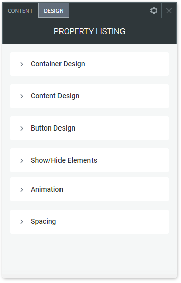
Container Design
- Background Colour. Background colour of each of the property listings
- Each Container Width. The width of each listing containers
- Layout. The layout of the lisitings
- Image Height. The image display height
- Border (Around Container). Border around each listing container
- Margin Top/Bottom/Left/Right. The margin top, bottom, left and right of each listing container
Content Design
- Dividers. The dividers between each of the text fields
- Title Style. The style of the title text
- Icon Numbers. The style of the numbers beside the icons
- Location Text. The style for the location text
- Cost Text. The style of the cost/price text
- Description Text. The style of the description text
- Banner Background Colour. The background colour of the banner if enabled
- Banner Text. The style of the banner text if enabled
Button Design
- Button Colour. Button background colour
- Button Colour Hover. Button background colour on hover
- Button Text Style. The buttons text style
- Button Hover Text Style. The buttons text style on hover
Show/Hide Elements
- Show and hide specific elements on all property listings
- Show/Hide Image
- Show/Hide Title
- Show/Hide Icons
- Show/Hide Location
- Show/Hide Cost
- Show/Hide Details
- Show/Hide Button