
Side Navigation Widget
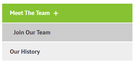
This widget will automatically display all other visible* pages from the same sub-menu / folder as the page you place it on. It will expand to display the third level pages if there are any.
*Does not show pages hidden from menu
To see a live preview of this widget please visit our demo site https://www.smithjones.co.nz/who-we-are
Content Editor
To access the content editor, right-click the widget, and click Edit Content.
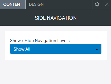
You also have the additional options.
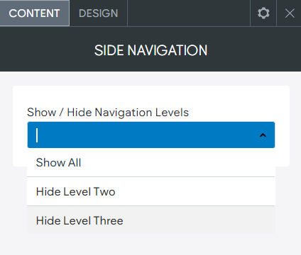
- Show All. Show the visible second and third level pages.
- Hide Level Two. This will hide the second level pages, this mostly would be used on a third page if you didn't want to display the second level pages, maybe because there are several and the navigation is too long.
- Hide Level Three. Hides the third level pages, this stops the expansion of the third level navigation items, could be used if you wanted the user to go to an index page first before going to the individual third level pages.
Design Editor
To access the design editor, right-click the widget, and click Edit Design.
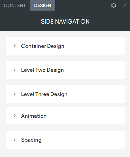
Container Design
NOTE: These are the settings for the container around the outside of the navigation.
- Background. Background of the navigation container.
- Padding. Padding on the inside, around the navigation.
- Margin. Margin on the outside of the navigation container.
- Rounded Corners. Rounded corners on the navigation container.
- Border. Border around the outside of the navigation.
Level Two Design
- Button Padding. Padding on the top/bottom and left/right inside of the button.
- Margin Between Buttons. Margin/gap between the buttons.
- Level Two Text (Hover & Active). The size/style and colour of the button text, including the button hover and active text design.
- Button Colour (Hover & Active). The button background colour, including the button hover and active background colour.
- Icon Selection. Select different design options for the icon.
- Icon Colour (Hover & Active). The icon colour including the hover and active icon colour.
- Icon Size. The icon size.
- Border (Hover & Active). The border colour around the button, including the hover and active border colour.
- Rounded Corners. Rounded corners on the button.
Level Three Design
- Button Padding. Padding on the top/bottom and left/right inside of the button.
- Margin Between Buttons. Margin/gap between the buttons.
- Level Three Text (Hover & Active). The size/style and colour of the button text, including the button hover and active text design.
- Button Colour (Hover & Active). The button background colour, including the button hover and active background colour.
- Border (Hover & Active). The border colour around the button, including the hover and active border colour.
- Rounded Corners. Rounded corners on the button.