Advanced Accordion Widget
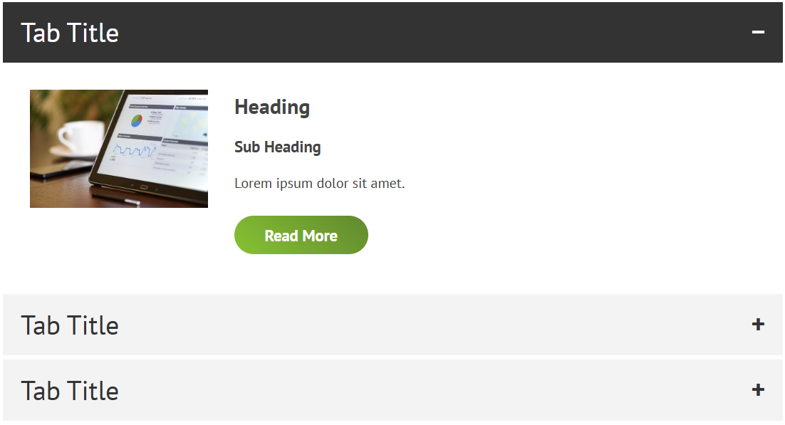
Similar to the Accordion Widget, which is used to expand additional content under main headings or titles, but with additional options, such as having an image or icon in the expanded content area, and more control over the design of the expanded content area.
To add the Advanced Accordion Widget:
- In the left panel, click Elements.
- Click and drag the Advanced Accordion Widget into your site.
To learn more about adding widgets to your site, see Add Widgets.
Content Editor
Right-click the widget and click Edit Content. Select one of the following:
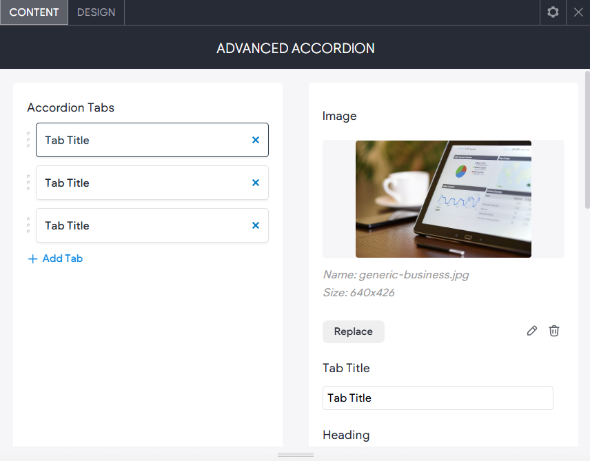
- Accordion Tabs. To start, you will see three example tabs, these can be edited or deleted.
- Image (and Icon). The image or icon you want to have appear in the expanded content area. You can toggle between image and icon in the CONTENT tab below or remove the image/icon under Show/Hide Content Elements.
- Tab Title. The text that will appear on the expandable tab.
- Heading. The large heading in the expanded content.
- Sub Heading. The smaller/sub heading in the expanded content.
- Large Text. The content text area in the expanded content.
- Button Text. The text inside the button in the expanded content area.
- Button Link. The link the button goes to.
- Show/Hide Content Elements. Toggle the options to show/hide elements in the expanded content area.
- Add Tab. Add additional, expandable tabs.
Design Editor
Right-click the widget and click Edit Design.
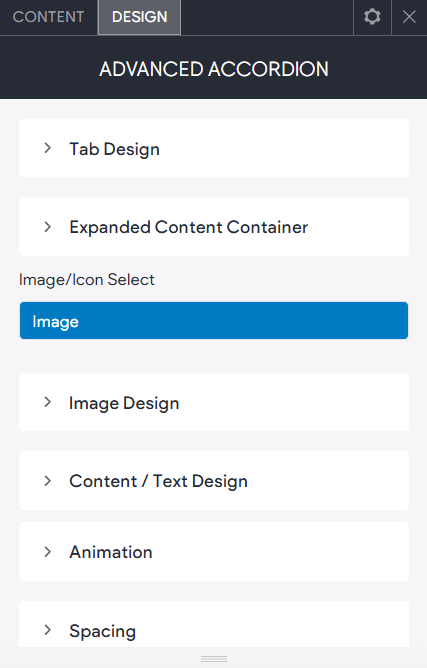
- Tab Design. Change the size, colour, hover colour, text and icon styles of the main tab.
- Expanded Content Container. Change the image/icon alignment, padding and background colour of the expanded content area.
- Image/Icon Select. Toggle between an image or icon in the expanded content area.
- Image/Icon Design. The image size or icon size/colour dependant on the option selected above.
- Content / Text Design. The text size, font, colour and margins inside the expanded content area.